Now that I'm using the brighter colours from this palette, it is getting easier to create my daily outfits!
 |
| Outfit for day four |
I'm committing a fashion faux pas in the above outfit, as I'm wearing trainers! However, as we do a lot of walking on holiday, I would probably include a pair of trainers in my travel capsule. My excuse on day four was that we were walking our dog Lisa in the afternoon and going on rough tracks in the countryside.
 |
| Outfit for day five |
On day five I wore a red top that I will wear with the matching skirt when I'm on holiday - if it's warm enough. As it's been cold this week I wore my top with the dark brown leggings instead. The top is bright so it holds its own with these leggings. I wore a pendant to break up the red expanse and hopefully create that longer, slimmer look that I'm always looking for!
 |
| Outfit for day six |
The combination of olive green top and dark red trousers was a bit dark, so I decided to add this cardigan. It is the one that I had used as a replacement during the previous challenge, when I discovered that my original cardigan was too long, so a bit of a cheat here! It looked better with this outfit than the green cardigan that I had picked for this capsule, so again it helps to test drive a potential travel capsule before going on holiday.
I had two tops to choose from for day seven: the weather decided it for me, as temperatures are plummeting, so I wore my thick Fatface jumper with a camisole underneath.
 |
| Outfit for day seven |
This is another neutral outfit, though my necklace and gold trainers help to lighten the look.
I thought it might be interesting to look at the outfits for each colour palette and see which one worked best.
 |
| Outfits for colour palette 1 |
 |
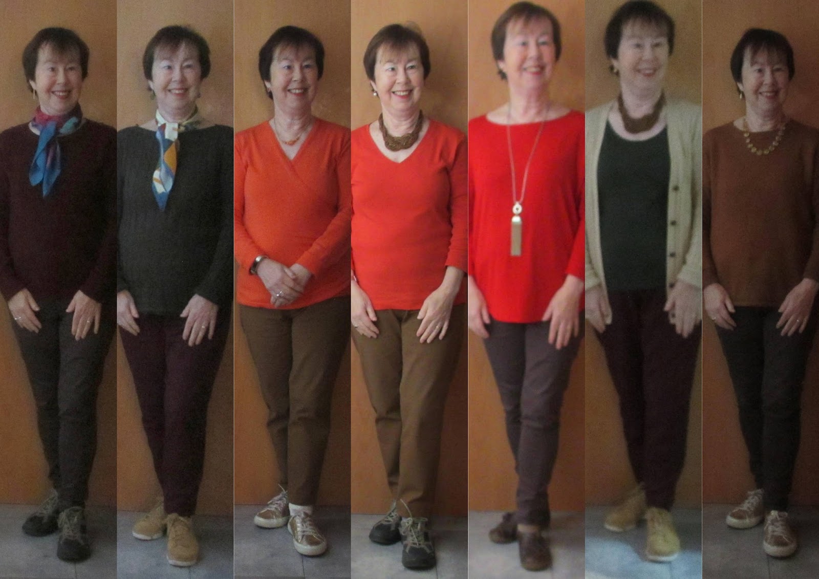
Outfits for colour palette 2
|
I'm being indecisive here, as I think there was a bit more variety in colour palette one, however I do love the reds in colour palette two. I might go for colour palette one for my trip to London and colour palette two for my holiday in Salamanca. Or maybe just mix and match them? What do you think? Which colour palette do you prefer and which individual outfits do you think flatter me the most?


Sue I kept going back and forth between the two trying to figure out why I preferred the second one. I think I am biased against light pants even though my hair is light. You look good in both and I think the top wardrobe is more casual than the bottom one. I think the dark pants balance out your hair, and the red tops are your best.
ReplyDeleteThanks, Sharon. I must admit that I prefer darker bottoms when going on holiday - partly for practical reasons as they don't show up stains! Good point about dark pants balancing out my dark hair.
DeleteWhile all are very nice, palette 2, day 5 is my absolute favorite. You truly do shine in bright, warm colors! I can hardly wait to see that top with its matching skirt. I'll bet it would be lovely with Autumn's "oyster white". Great job putting things together. As I approach 71 with severe limitations from advanced arthritis, it is sometimes torture to see everyone make or put together wonderful outfits since I really don't go out much anymore. Terrible for someone who truly loves clothes and lovely fabrics.
ReplyDeleteThanks for your lovely comments, Nancy. So sorry to hear about your health problems, which I can truly sympathise with as I was diagnosed with arthritis of the jaw in 2016 (my family made several jokes about over-use!) and I know how painful it was. I started following an anti-inflammatory diet plus taking supplements such as Omega-3 and glucosamine sulphate, which has certainly helped me. It must be terrible to not go out much, however what I would advise is still wearing lovely outfits at home, in colours that make you feel good. You owe that to yourself. I know that wearing red always gives me a boost. Take care. Hugs. Sue
DeleteHi. How brave of you to share all these outfits. I've gone back and forth and decided that neither one was 100%. I like the striped top and dark bottoms. Can't tell if it's navy and white or black and white. With the red necklace, I like what it does for your complexion. I don't think the beige near your face does you any favors. Do you have any shots of you wearing a true white shirt or something in cherry red? The reds you show appear to skew towards bittersweet or more orange. I like the vibrancy but think there is too much yellow in the color to be your best color. Teal and olive are not my favs on you. Having said all that, the colors appearing on my screen may not be the colors in real life. If you like the colors and feel good wearing them, then that is what matters.
ReplyDeleteHi Penny. Thanks for your comments. The striped top is navy and white, though a fairly dark navy. True white looks harsh on me, so I no longer have any white tops or shirts. You make a good point about colours on screens not necessarily looking the same as in real life - one of the hazards of on-line shopping! You also make another good point: feeling good about what you're wearing is very important. Sue
DeleteHi Sue
ReplyDeleteSorry I’m so late to the party. I think my favourite is colourway 2, number 3. I really like the vee neck style on you with the lighter necklace. Number 4 is a close second but I think the heavier necklace draws the eye to it and overtakes the whole outfit. I do prefer the darker pants. They are all lovely outfits but 3 is my favourite ��